Monday, June 30, 2008

Meet Camino

Recently I was asked to paint a commission.
The first thing that I usually say when someone asks if I paint commissions is, "hmmmm, well... sometimes... It depends on what it is."
The second thing I say is, "It might take a while."
After exchanging a few emails and speaking with the clients at my gallery, we decided to meet at their place so we could further discuss what they were interested in having me paint.

I have been working on several paintings since our meeting and full time since I returned from my painting trip. I wanted to wait before posting any of them here until I had met with my clients to view the progress.
One painting was to be of their horse, Camino. He is a beautiful horse. I got to know him and we had a long photo shoot. Deciding how to portray him in one painting was hard. I decided to start with a few small paintings to get the hang of painting him.
I went for a simple design on these two with three main values. Light, mid tone and dark.


"Camino", 6" x 8" oil on board, Frank Gardner © 2008
Private Collection


"Camino and Thomas", 6" x 8" oil on board, Frank Gardner © 2008
Not For Sale


Today was the first time they had seen what I had been painting. I need to have everything finished and signed before I leave for vacation next week, so I shared the paintings with them today to see if I was on the right track and to get their feedback. They really liked what I had done.

My client spoke of how much she enjoys her rides on Camino. One of the workers where she boards her horse and the ranch dogs always join her. I wanted to capture that companionship in a painting.
It is not so much a portrait of Camino like the top two. It's more of the overall feeling of the ride, the company, and the location.


"Good Company", 14" x 18" oil on linen, Frank Gardner © 2008
Private Collection

These three were among the paintings I brought out to show them today. They kept "Camino" and "Good Company".
"Camino and Thomas" has made its way into my daughter's growing art collection.

I have more to share with you. I'll try and get another post up tomorrow. Thanks for looking.

Sunday, June 22, 2008

"The Rogue and the Misfit"

'The Rogue and the Misfit" was one of the paintings I posted while I was on my painting trip. I made a few adjustments before I framed it up that are worth showing. The color in the photo is a little more accurate also. I re-posted the original photo again so you can compare them both.


"The Rogue and The Misfit", 8" x 10" oil on linen, Frank Gardner © 2008
$720. Framed. Available at Galeria Gardner


"The Rogue and The Misfit" before adjustments, Frank Gardner © 2008

There was no need to change much, but a few small adjustments in the right spots can make a world of difference sometimes.
Notice the slight difference in the black rigging on the back of the blue boat, the "Rogue". You can compare the position and angles to the piling of the pier, which was not adjusted. There were a few adjustments made to the buildings and trees on the left side as well. The blue barrels on the right side of the pier had a shadow color added and the "Rogue" also was darkened just a bit in the shadow. I may have drawn a crisper white line along the stern on the far side of the "Misfit" too.

I have been working on studies for some commission paintings, but I am not ready to post any of that just yet. Hopefully in the next day or two I can show you some of what I am working on.

Friday, June 20, 2008

"Rock Harbor Pair"

This was the first painting that I did on my trip to the Cape.
These two boats were tied up in Rock Harbor, in Orleans.
The day started out nice enough, but clouded up fast and got pretty windy. The tide was going out and dropped pretty fast.
For me at least.
Not used to that.
The light totally changed on me when the rain clouds moved in from behind me. I almost chased it but caught myself doing it and managed to hold onto the light of the earlier, sunnier skies.


"Rock Harbor Pair", 11" x 14" oil on linen, Frank Gardner © 2008
$950. Framed. Available at Galeria Gardner

Wednesday, June 18, 2008

"Orleans Number Two"

This was painted on the beach in Orleans, Ma. on Little Pleasant Bay. I believe it was a wildlife sanctuary of some sort on this side of the inlet. There were just a few adjustments that I needed to make to it the next day.


"Orleans Number Two", 8" x 16" oil on linen, Frank Gardner © 2008
$930. Framed. Available at Galeria Gardner


Detail of "Orleans Number Two", Frank Gardner © 2008

Friday, June 13, 2008

"The Lobster Pot"

The Lobster Pot Restaurant is one of my favorite Provincetown landmarks.
This painting was done from a photo reference on one of the rainy evenings during my trip to Cape Cod. I had really hoped to get back to Ptown to do some street scenes, but the weather kind of went sour on us. That should not have kept me from painting outside, but we just were not up for getting wet in a cold rain.
I need an umbrella.


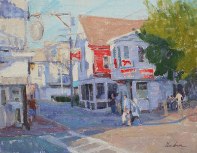
"The Lobster Pot", 11" x 14" oil on linen, Frank Gardner © 2008
$950. Framed. Available at Galeria Gardner


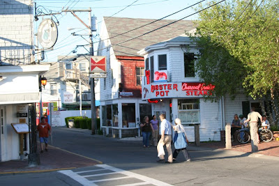
Reference photo for "The Lobster Pot", Frank Gardner © 2008


My friend Jack Riddle was talking about painting from photos on his blog the other day and suggested that I might write a few of my thoughts about that.

Here goes.

I always feel like I am taking a big risk when I post the reference photo next to my painting or a photo of the scene with the painting. Will all of my "mistakes" stand out like sore thumbs.

There are so many things to consider when using a photo reference. I could go on and on about pros and cons. One big con is that the values are usually a bit off. The darks are too dark and or the lights are too light and washed out. One pro is that it does not move and the light does not change, but that can be a con too.

Something I take into consideration when working from a photo is the look and or feel that I am aiming for in the finished piece. How much detail will I try and put into it. The problem with working from photos in the studio is that you can just keep going and going, adding in every little thing until it is really tight and probably over worked. It becomes a matter of taste and style.

The look that I decided on for this one was a solid design with a loose plein air feel. This was a plein air trip after all, and I wanted this painting to fit in well when hung together with the rest of the stuff from the trip.
I'm sure that this scene would look just as good if I had done a tighter job and brought it up to a more detailed finish, but that is not what I wanted in this particular painting.
By solid design I mean a strong pattern of light and shadow. Little details that are not real important can be edited out. Kind of like when I am plein air painting. Get the basic light and shadow pattern down first, add variety of color to the large value pattern, work up the detail in the center of interest. Get the important stuff down first, and then you can stop at any point.

The first thing that I did was evaluate two photos that I had of this street scene and chose the one that best suited my needs. I wanted the Lobster Pot to be the main interest, but the people are also an important part of Provincetown, so I wanted to feature them too. Couples walking, someone with a bike, that is all part of what makes it real. I liked having the building on the left to frame the street, but I did not want to add detail there that would take away from the Lobster Pot.

The neon sign is such an icon. I wanted to show it, but I did not want so much detail in it that it would hold the eye and not allow for movement in the painting. What I tried to get was the color and glow without even putting in any letters. It was one of the first things that I painted in. Almost pure cadmium red, thin enough to get the glow from the white tone of the linen showing through. Then I concentrated on just blocking in all of the shadow colors. I wanted to keep them lighter than what I was seeing in the photo. I tried to get a lot of variety in my colors but keep them all in a simple value range. I wish that I had taken some progress shots to help explain how I went about this.

Since I had determined that this would be a loose piece, working fairly fast was key. I approached it as if I was standing there on the corner trying to catch the important stuff first and fast. The big picture. When you see the reference photo along with the finished painting, it is easy to pick out little things that I did not include or may have drawn a little off, but is that detail important to the statement as a whole? Not for ME in THIS painting.
I'll try and point out a few examples of what I mean by lack of detail. Take a look at the budweiser sign. Did you know that it was a bud sign without having the words written out? O.K., my lobster may look a bit like a little red dog, but I bet that anyone that know Ptown knows that it is the lobster Pot. How about the tree? There could be a lot of picking at that and spotty leaves painted in, but the simple light/ shadow pattern works good enough in this case. The two figures in shadow walking in front of the restaurant. Can you tell that is two women? or at least feel the gesture of two figures walking casually? Good enough then. I think that the storefront windows behind them has just enough detail to know there is something in the window. When you stare at a photo you may be tempted to put in more and more in a thing like that.

I did not start adding any light family colors until I had a solid drawing down of color in shadow and most of it all linked together into a big pattern. Then I quickly laid in the light family colors. I put them in thick and then even scrapped some back off because texture always comes forward. I left the thicker stuff for the foreground and mid ground. I really had to rein in my urge to keep adding detail at this stage. My natural tendency is to make it all perfect. I wanted this to look like it could have been done on location in one go, so I stopped while I thought it still looked fresh. Could I have done some things differently? Sure. But each painting has to be thought of as an expression of your feelings. This is how I felt about it on this day. If I did it again today I might have a totally different set of colors and criteria.

That's all I'll write on my thoughts on this piece, and painting from photos for now. I'll probably end up expanding on this in the comments anyway. Thanks Jack for thinking that I might have some skills to share here. I'll work on some other posts along the same lines.

If anyone is still reading at this point, thanks.
I usually don't write such long winded posts.

Thursday, June 12, 2008

"Blue Skies, Blue Ocean"

This is one of the paintings that I posted during my painting trip. It is one of the ones that needed a little adjustment back in the studio. The rigging on the boats was slightly off, especially that one line on the left that was curving up when it should have gone straight or curved slightly in from the weight. The only other change was to darken the values of the shadow sides just a bit. You can tell if you look at the distant water between the two boats. That value stayed the same.
The color in the photo of the finished painting is more accurate as well.
I am much happier with the finished piece.
I'll re post how it looked when I stopped work on the dock, as well as the set up, so you can compare the two.


"Blue Skies, Blue Ocean", 11" x 14", Frank Gardner © 2008
$950. Framed. Available at Galeria Gardner


First Version "Blue Skies, Blue Ocean", 11" x 14", Frank Gardner © 2008


The set up on the docks in Provincetown.

It was real fun painting out on the pier in Provincetown. It is amazing how fast the tide makes the boats go up and down.
The other great thing about painting boats is that they usually have names that make for good titles and I don't have to struggle too hard to come up with one. Yes, they are called the Blue Skies and the Blue Ocean.

Monday, June 9, 2008

"The Constance Sea"

The colors of this boat set against the colors of the sand and ocean really attracted me to this scene. The reflection was an added bonus. Those of you who have done plein air paintings of boats, or water, know that reflections come and go and change quite often.


"The Constance Sea", 8" x 10" oil on linen, Frank Gardner © 2008
Private Collection


The toned canvas was a wipe out from the day before. It worked perfectly in this painting since it was pretty much the color of the sand.

This boat, "The Constance Sea", is in Chatham, Ma.
After painting the "Little Dinghy" I turned around in the same spot. I even got to keep my bare feet in the same cool hole that I had dug them into for the other piece. Painting on the beach is great. The sun had dropped quite a bit and the light was just right.

Sunday, June 8, 2008

"Little Dinghy"

The simplicity of this dinghy pulled up on the beach was what attracted me to paint this one.


"Little Dinghy", 8" x 10" oil on board, Frank Gardner © 2008
$720. Framed, available at Galeria Gardner

We had a wet finish to my week on Cape Cod. It cut down on some of our outdoor painting time, but it gave me a chance to make some slight adjustments on a few of the paintings back in the studio.
I completed nine paintings and had to sign and title them, get the frames all wired up and take some quick photos of the finished paintings. I left them all out there at my friend Jerome Greene's gallery in Dennis, so I had to have everything ready to leave with him on my way off the Cape.

Wednesday, June 4, 2008

Some Paintings from the Trip

In case you have been wondering what I have been up to, here is a quick upload of a few of the plein air paintings from this week. I'll just post sizes of these. When I get a chance to sign them and decide on titles, I will re post them all. There are more paintings,photos and stories to tell, but I don't want to put too much time into this right now. I am here to paint.


"East Dennis Marsh", 8" x 16" oil on linen, Frank Gardner © 2008
$930. Framed. Available at Galeria Gardner


"The Rogue and The Misfit", 8" x 10" oil on linen, Frank Gardner © 2008
$720. Framed. Available at Galeria Gardner


"The Wreck", 8" x 10" oil on linen, Frank Gardner © 2008
$720. Framed. Available at Galeria Gardner


My setup and subject on the pier in Provincetown.


"Blue Skies, Blue Ocean" in progress, 11" x 14" oil on linen, Frank Gardner © 2008
$950. Framed. Available at Galeria Gardner

Two more reviews by Elijah

Elijah, has posted two more reviews of my paintings on his site, Art and Critique.
You can read them here and here.
Thanks to all of you who took the time to read the first one.