I am working on several posts based on the idea of pre mixing color on the palette before painting. There is so much to talk about here that I feel the best way to go about it is to do several posts. I don't want everyone to get bored, and I don't want to overload a blog post with too many ideas.
I'll try and not repeat myself too much. If you have not read my previous post on pre mixing color, it is here.
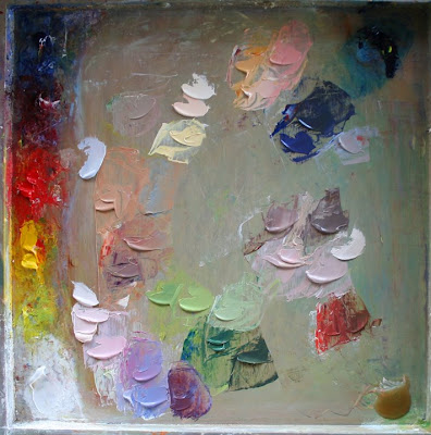
On this one I worked from a photo, mixing colors for about twenty minutes. I started by mixing my lightest shadow color, which is the woman's sweater in shadow. I compared the values of all of the other colors to that.
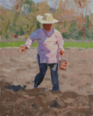
Then I blocked in the main masses of the painting for about thirty minutes without mixing any new colors.
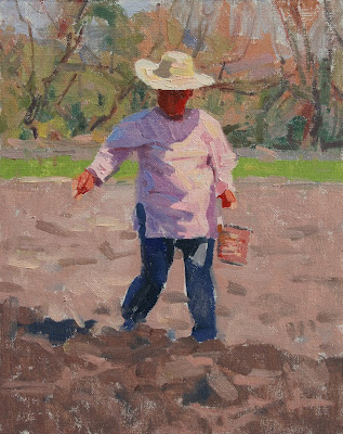
After that, I began breaking those main masses up into smaller shapes for another ten or fifteen minutes. Mostly in the background trees. I realized that I was going beyond the purpose of this post so I stopped.
Photos below - (1) palette, (2) after 30 min., (3) after 10-15 min. more.


"The Sower", 10" x 8" oil on linen, 2008
Private Collection
I find that key issues that many students in my classes face are seeing color and value, mixing accurate color, working too slowly to catch the rapidly changing light, and painting the details before the main masses are blocked in accurately. I wanted to find a way to focus on these issues.
It is all about getting the right color, making it the right shape, and putting it in the right spot.
I would like to add a few quotes from "Hawthorne on Painting". If you don't have this book, get it. It is only like six bucks. I have read it at least twenty times. Each time I pick up on something new, something that helps me with where I am at the moment.
"The mechanics of putting one spot of color next to another - the fundamental thing."
"Remember, no amount of good drawing will pull you out if your colors are not true, get them true and you will be surprised how little else you will need."
"Do studies, not pictures. Know when you are licked - start another. Be alive, stop when your interest is lost....... It is so hard and long before a student comes to the realization that these few large simple spots in right relations are the most important things in the study of painting. They are the fundamentals of all painting."
"A mass either stays within the lights or it falls into the range of the darks, and by half squinting the eyes you can tell to which it belongs. Remember, the eye takes in all your big lights against all your big darks."
I'll stop there for now.
18 comments:
Frank--this is really good stuff and so helpful. I think one of your many gifts is "seeing" all the colors in a setting, and adding some, that make a painting special. The pinks and blues in the purple shadow area, the yellow tones in the light area, the pink in the hat, the subtle greens, etc. It's more than intellect, it is a form of intuition. So nice that you can teach like this from afar. I like the Hawthorne references, too. I'll keep looking... Jack
Hi Jack. Thanks for checking in and for your comments. I really appreciate the feedback and knowing that some of this helps.
It is also good to have a place to throw in some quotes like this. There is really no time for too much of that in a class.
Hey Frank,
The painting has a nice sense of hot light. Rich colors in shadows and lights. The Hawthorne book is a treasure. It's just full of gems. He gives soem of the best advice one can find on how to put together a good painting. One of the biggest challenges is getting your mind in the right place while you're painting, and then thinking about the right things while you work. The whole exercise does boil down to putting pieces of color on canvas and seeing how they relate to each other. And I feel the same way, every time I pick up that book I find pertinent advice. Good post.
Thanks, Frank for showing how you organize your mixed colors on the palette. It is helpful to see how you compare them side by side on the neutral background before you begin painting.
The painting has a wonderful sense of intense light--love the lively shadow colors.
thanks for taking the time to share your process,
Faye
i'm like a kid on christmas morning... was excited to see the premix seminar had begun. funny, i didnt care for them in college LOL
i'm new to this new method you showed me but i'm guessing you mix the lightest shadow so you know that everything in the light family has to be lighter and everything in the shadow family has to be darker? is that the thinking?
thanks for helping us all with this technical advice on a very hard to find subject. i googled everybody you associated with this and got zip. you da man!
Thanks Frank for doing these blogs. I'm reading it carefully trying hard to take it all in. When you do your next post would you mind showing us the photo you started with too? Sometimes I pre-mix but not always. I need to learn to make it a habit like you do. Keep it coming. Barb
Hey Colin. You are right about being able to get your mind in the right place while you are painting. I think this exercise kind of gives you a few minutes of meditation with your paints - becoming one with them so to speak and shutting out the rest of the world - before you actually get going with the putting the paint on part.
Hi Faye. I am glad that you enjoy seeing the palette.
You do get kind of a preview of how your painting will look.
Good to hear that you are excited about it Mike. I'll try and slip another present under the tree tonight.
That is exactly why I chose that value/ color, to compare everything else to it. THIS time. I do not always approach it like that. Sometimes I'll just go for the easiest mix first.
Barb, I don't always mix like this either. I do it more often if I am painting on location.
The next one is also from a photo, so I will include the reference.
Thanks for showing us your palette Frank. I think the biggest challenge here is to train our eyes to see the right colors and have a quick hand to mix it accordingly. So much to learn!
I love the brevity of those short, staccato strokes that indicate the field. Beautifully done.
Right Kate, it is hard to learn to "see" colors and be able to mix them. You need to have the surrounding colors right too, or the color will not look right.
Making decissions and mixing fast!
Thanks Don. I appreciate that. Working from a photo on this one, it was hard to just leave it at that.
Frank, this is such a gold mine of information. Thank you for your generosity in sharing all this information! And, per your advice, I took at look at the Hawthorne book ("search inside") on Amazon, and immediately ordered it. What a great resource, especially after seeing the principles so perfectly illustrated in your work.
Hi Kathryn, you will love the Hawthorne book.
Great information, Frank. Thanks for so generously taking the time to go through this. I'm sure I'll be referring to these posts again.
Thanks Bill, I'm glad that you are enjoying my ramblings about this. I find this method especially helpful if I have quickly changing light while working plein air.
Post a Comment